
3 years ago I walked into the Merc and it was finally (and officially!) ours. My heavens did we have our work cut out for us. I thought that it would be a year max before we had Phase 1 completely finished (insert maniacal laughter here).
We renovated for a year before we moved in and then, once we were here I was exhausted and the powerful, statement making spaces that I dreamed of were a little hazy. For 2 years most of the spaces we simply lived in, no design, no statements, just a blank slate waiting for creativity to get going again.
I feel like I keep saying this because I want you to know that if you are in that in between place, YOU ARE JUST FINE!! Be patient with yourself and the inspiration will come!
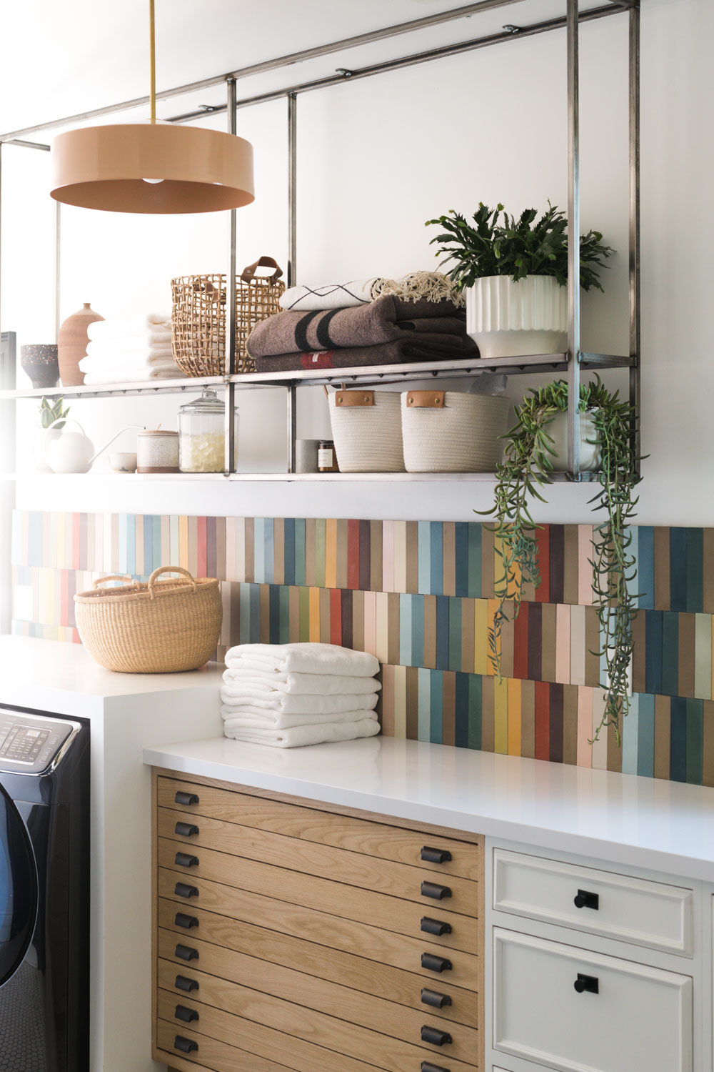
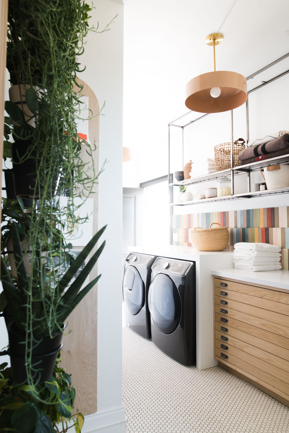
Finally I have a reveal to share, and I am over the moon in love with how our laundry/mud room worked out!
The Renovation
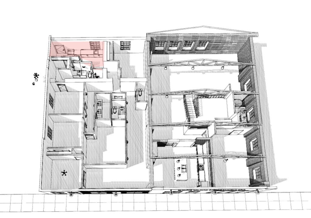
This is the floor plan for the Merc, the highlighted area is the laundry space!
For fun, let’s remember what this space looked like when we bought it.
Be prepared, it’s unrecognizable!! The door in the bathroom was converted to the main laundry window.
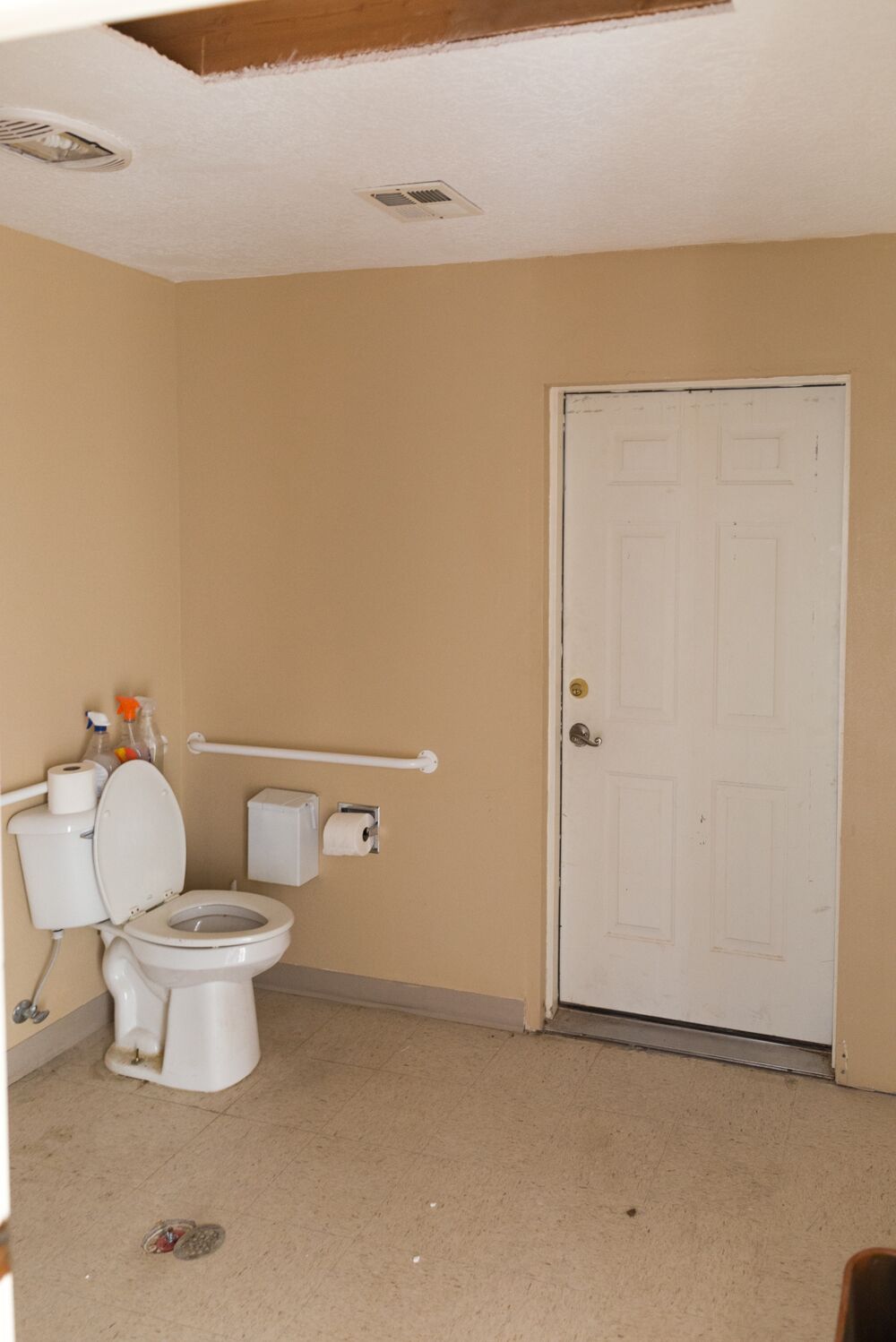
And you can see the light shining through the door in the back right corner. Crazy right!? This area was actually split in 1/2 and the left half was turned into Ivie’s bathroom, while the right half created the laundry/mudroom!
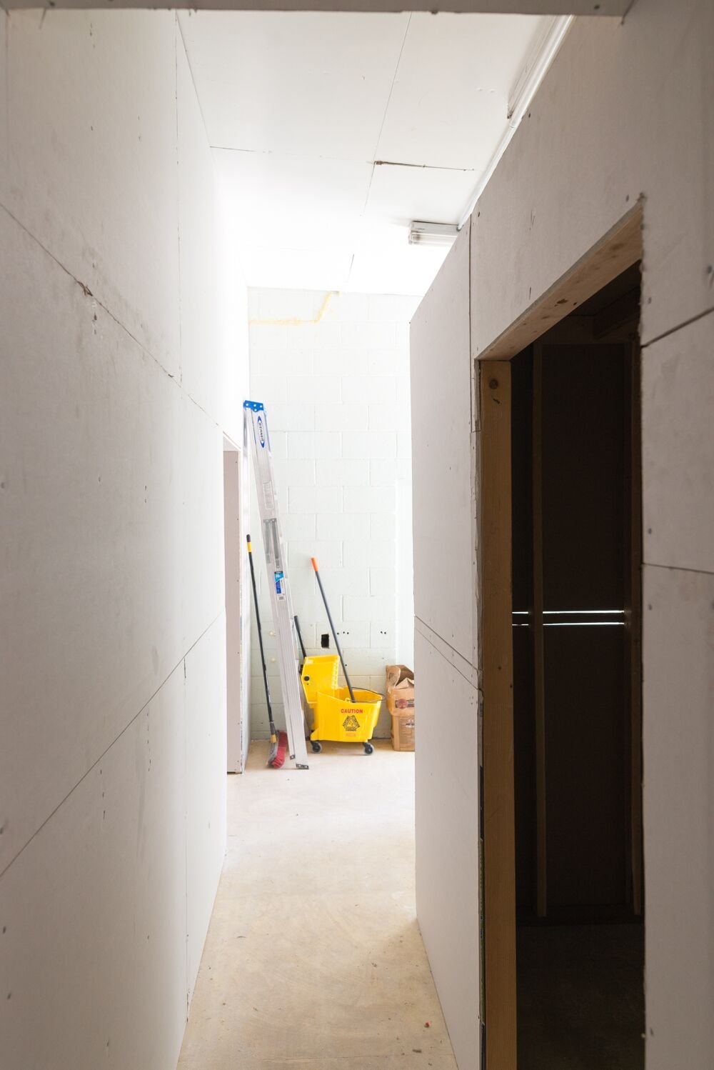 This
This
Demo and Framing
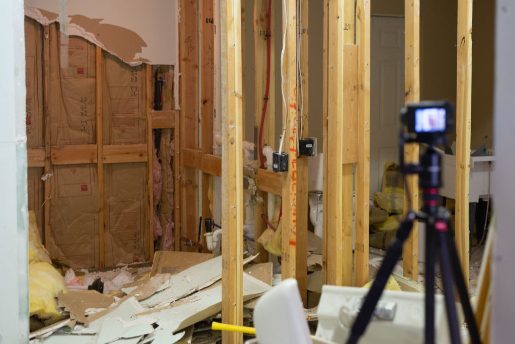
This was the first space that we demoed. There were 2 bathrooms that we removed and after 9 months of dreaming about ripping out the walls it was THE BEST FEELING!
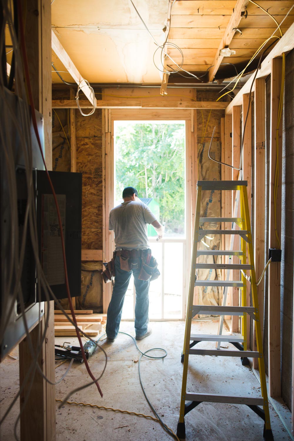
The framer came and closed off the doorway, and built the new walls (can you see it coming together!?)
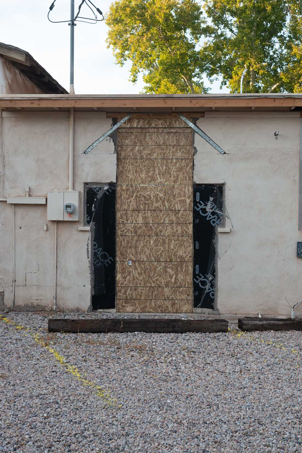
Oh and just for fun, this is what the outside looked like until the Andersen window was installed and the stucco was repaired! Learn all about our windows here!
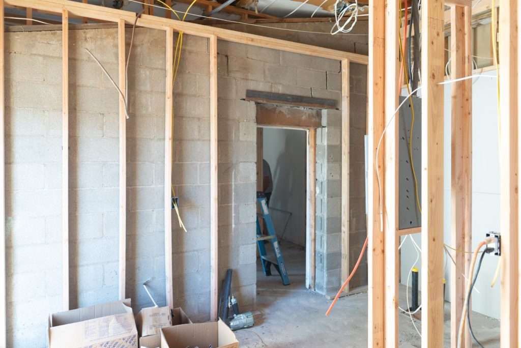
The far right wall was one of the Merc Perks that we had to maneuver around. This whole area was an addition (maybe #4 or #5?) and was built out of concrete block. We had to work with the existing doorways and came up with a sort of zig zag hallway. While we were working on the plans I was super nervous about it feeling like a maze, but it’s great and not weird at all!
We were able to raise the doorway a little (you can see the steel beam at the top of it, the wood header was also moved up!) The light on the left side of the picture is coming through the window.
Can you see the space on the floor where they had to remove the concrete and run new pipes?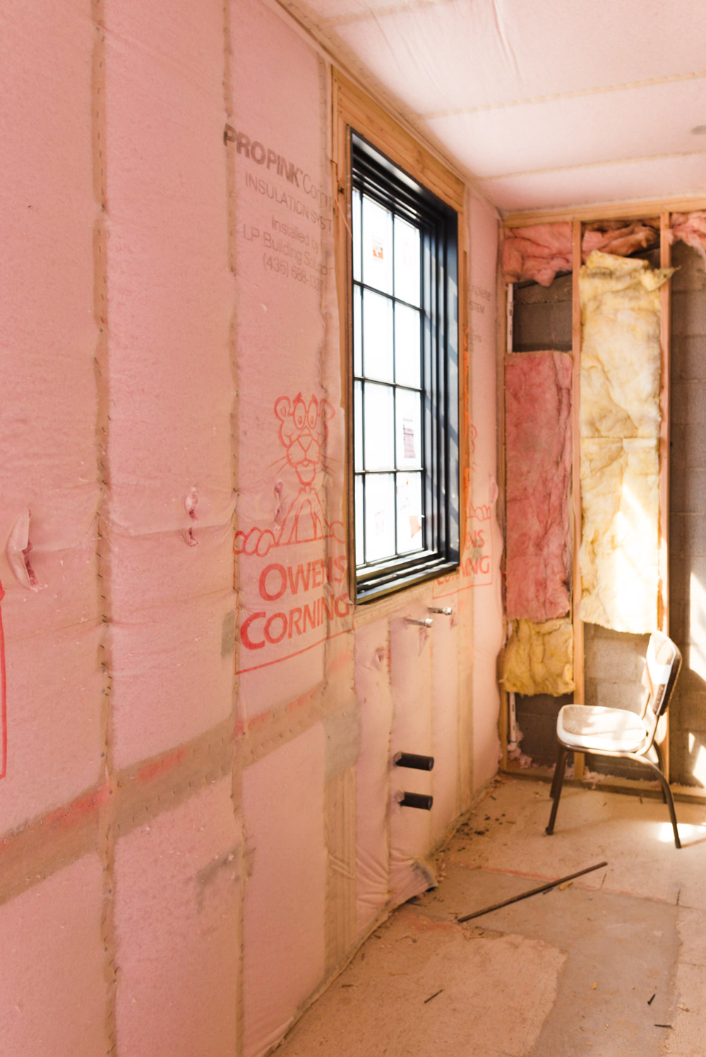
Drywall was magical!
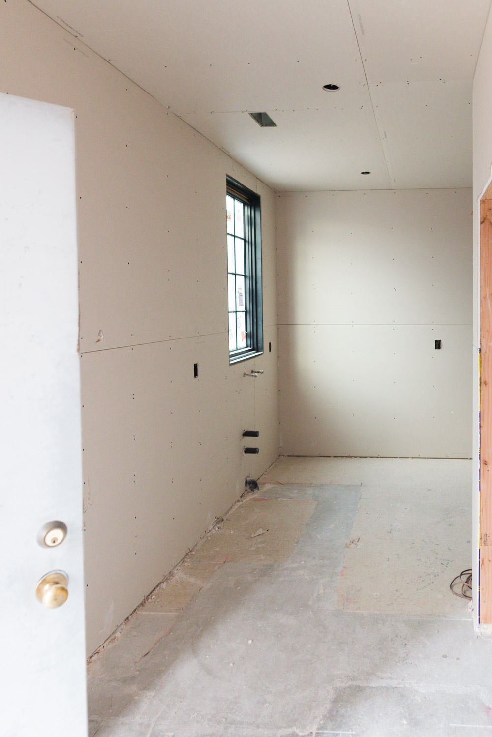
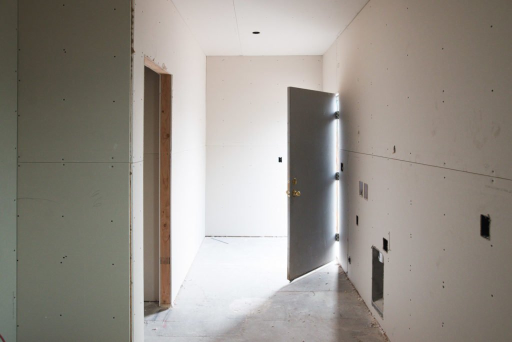
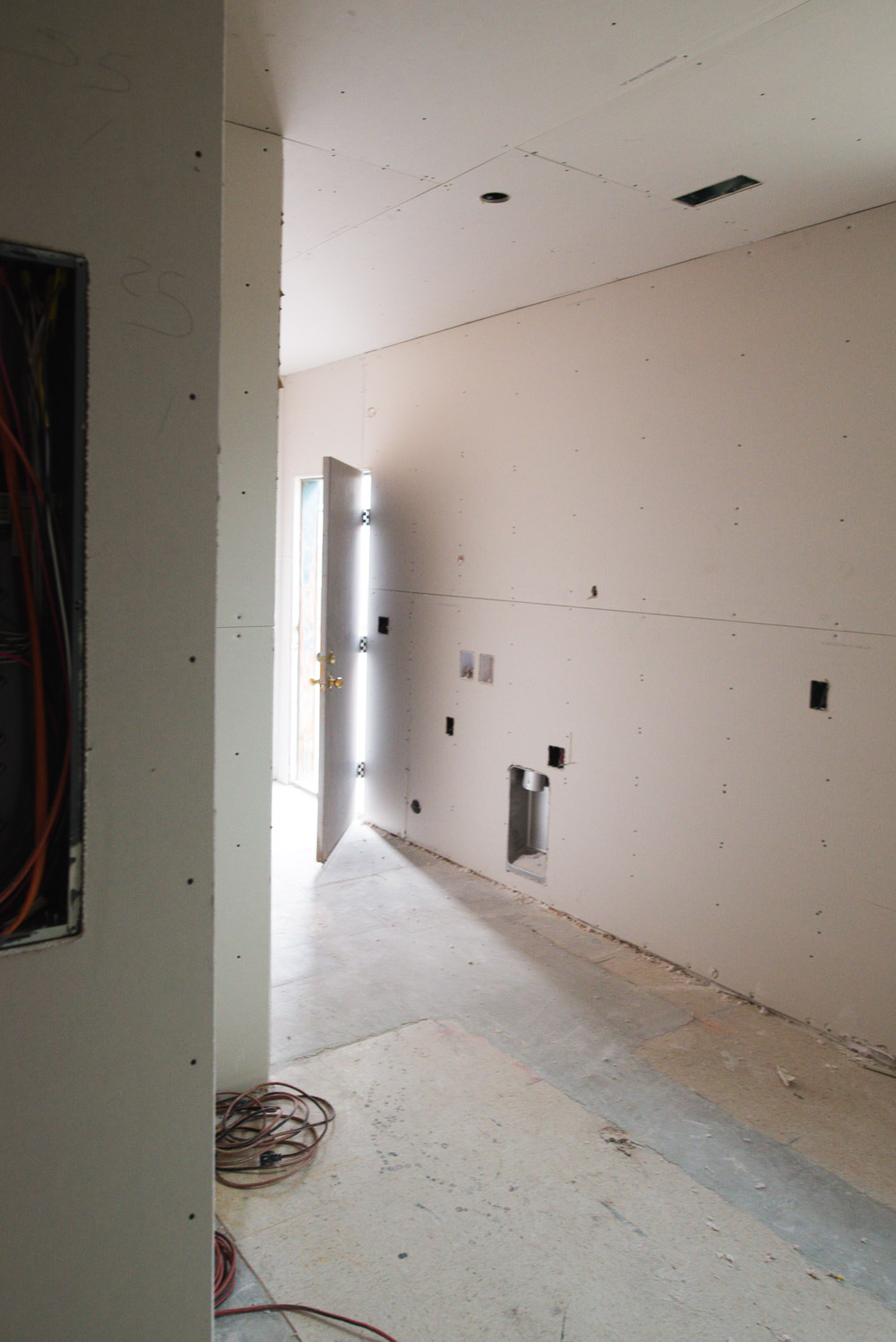
Now It’s Time for Design
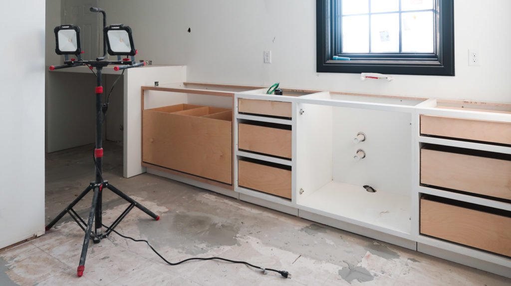
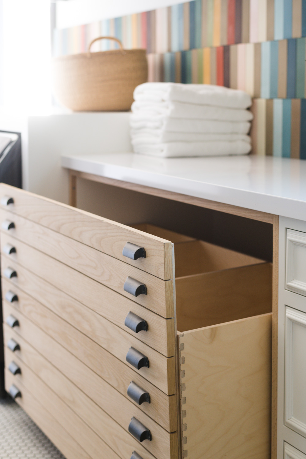
The cabinets were custom built by my friend Shawn at Aspen Mill. I wanted to do something special that had a nod to the age of the building and came up with the idea of a faux map cabinet/laundry sorter. It is one of my favorite parts of the Merc! You can see what the sorter looked like before the face was installed, there are 3 separate compartments and it pulls out like a giant drawer.
Lighting Tip:
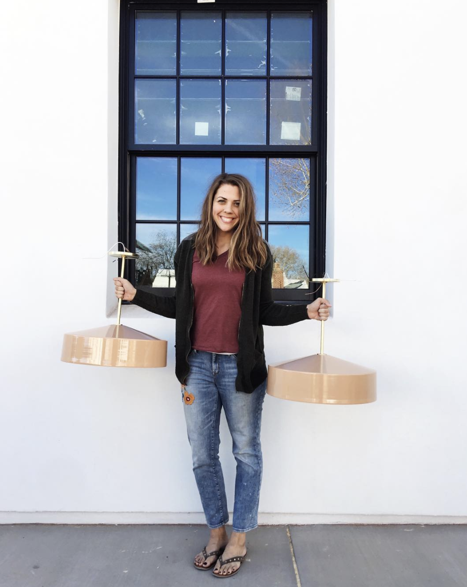
I was SO excited for the lights. If you have it in the budget, a great way to make a statement with lighting is to install pendant lights where you would naturally put can lights. This space is long and narrow and recessed lighting was the obvious choice but instead I went with these modern pendant lights from Triple Seven Home.
And this is kind of where it stayed for the better part of 2 years! (Pssst. dont be mad but I photoshopped out the exposed water shut off valve in the picture below.)
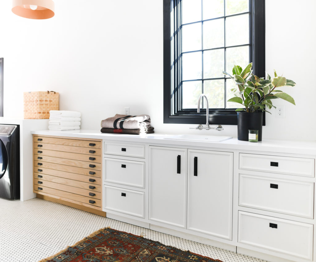
A blank slate that was fine and live-able, but not special. Ya know? Like, it’s good, but it’s not iconic.
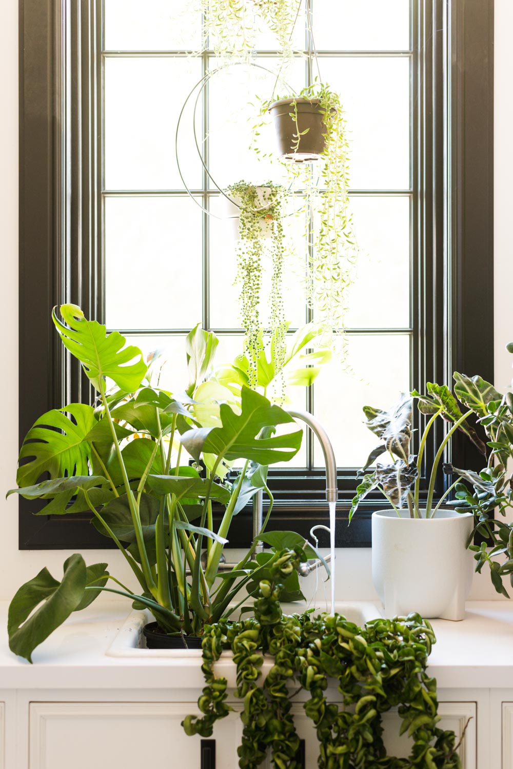
Also, it had become COMPLETELY overrun with plants and I needed a better system for keeping the back of the house plants happy! I dont have a great shot of them, but picture this times 42.
Rainbow Tile
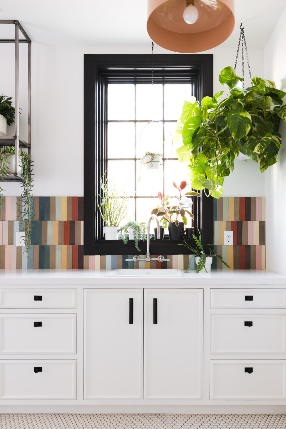
Fast forward to 2020. I came across the most incredible tile. I was looking for a great pattern (which Lili has a ton of!) But found these rainbow baguette tiles in the most perfect colors I couldnt even handle it.
Instantly my creativity was sparked and using this tile in the laundry room was all I thought about!
Can I Actually Do This!?
I’m not going to lie, it’s a big statement and I got the pit sweats on a few occasions and almost talked myself out of it. But I had a long come to Jesus about it and remembered why I wanted the Merc in the first place, to be different! And white tile, white cabinets, black windows, and plants were not going to get me the “I cant believe I get to live here” feeling that makes the Merc so special. So rainbow tile it was!
You guys came in clutch helping me sort through all of the options and I settled on a campy earthy modern rainbow pattern that is EXACTLY the vibe I wanted.
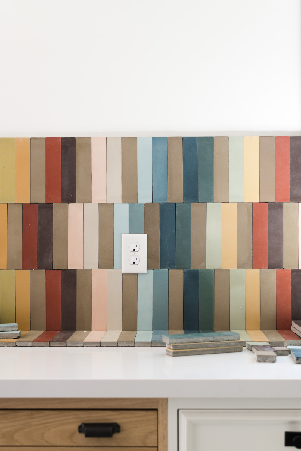
As it so happens to go with projects, there were some slight bumps in the road. You’d think after 10 years I’d have it figured out, but nope, failure FOREVER!!!
Because of the unpredictable mix of tile colors in the boxes I not only had no idea what to expect, but there were some colors that I only had a handful of. This lead me to come up with a plan to add a 4th row of tile to half of the wall and an upper cabinet on the other half.
Aannndddd Failure.
Granted I was still going to put a shelf along the top of the tile and inside the cabinet box, but I knew right away that this was NOT the right direction.
That’s one good thing about failing so often is that I know in my gut if it’s a good idea and bad execution or if it’s just a bad idea. This was the later.
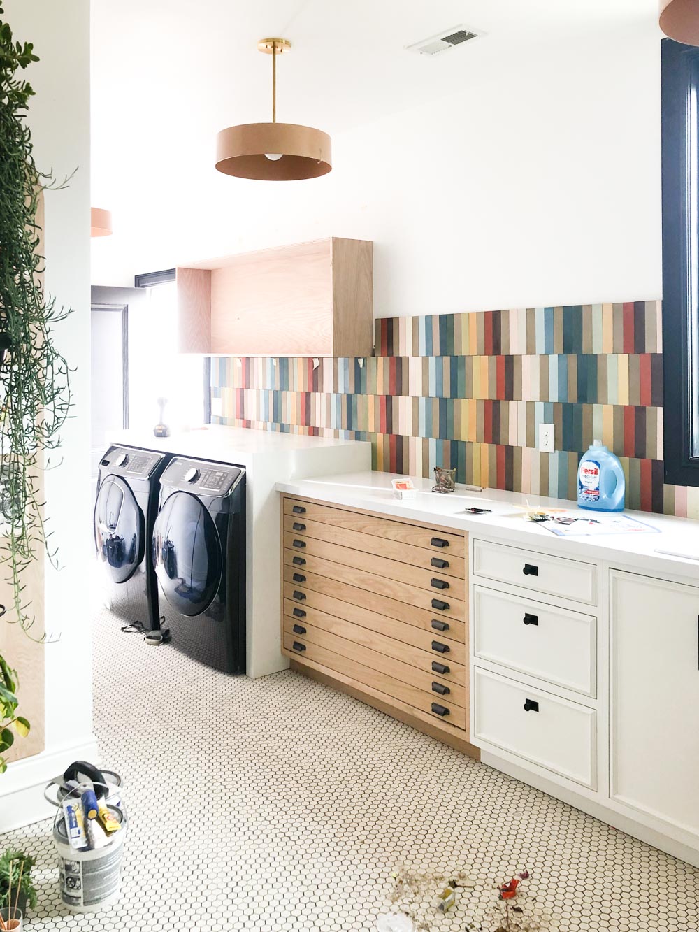
So off the cabinet came, and off the 4th row of tile came, and back to the drawing board.
I needed something grittier. The oak cabinet was too middle of the road, in terms of color and design. The shelf needed to be dark, but not polished painted black like the door and window. It also needed to be lightweight visually. The tile is screaming for attention and the shelf needs to not compete at all.
I called my friend Lee from Artisan Metal Design to see if he could weld a simple suspended shelf for me. Basically this table, flipped upside down and attached to the ceiling. He of course delivered and it looks incredible! Want to see?!
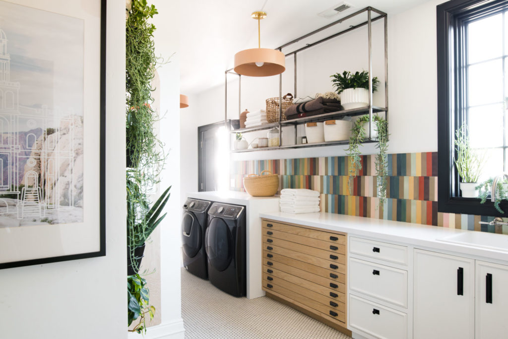

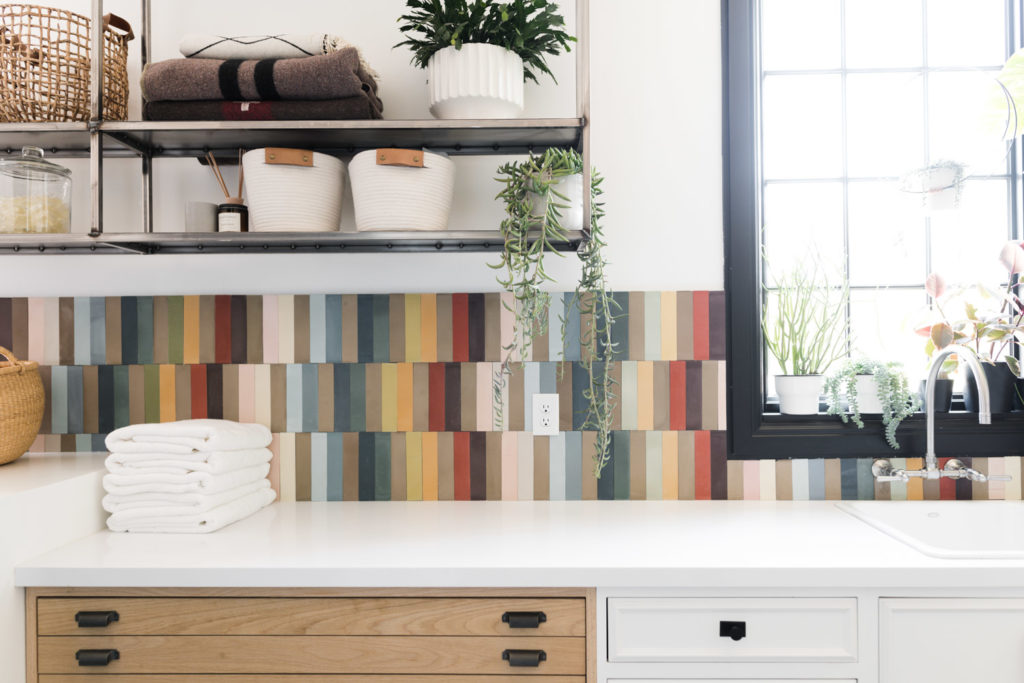
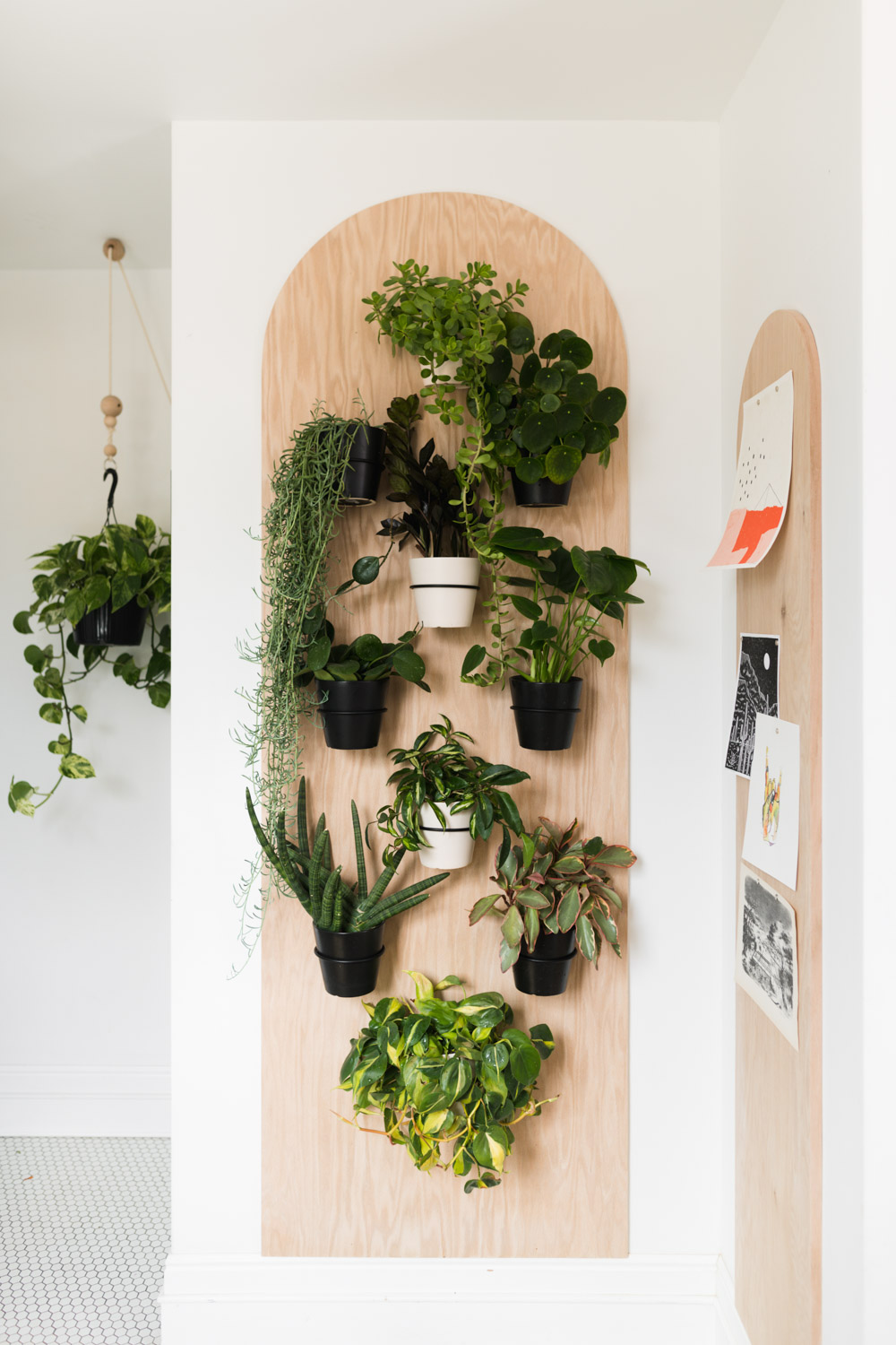
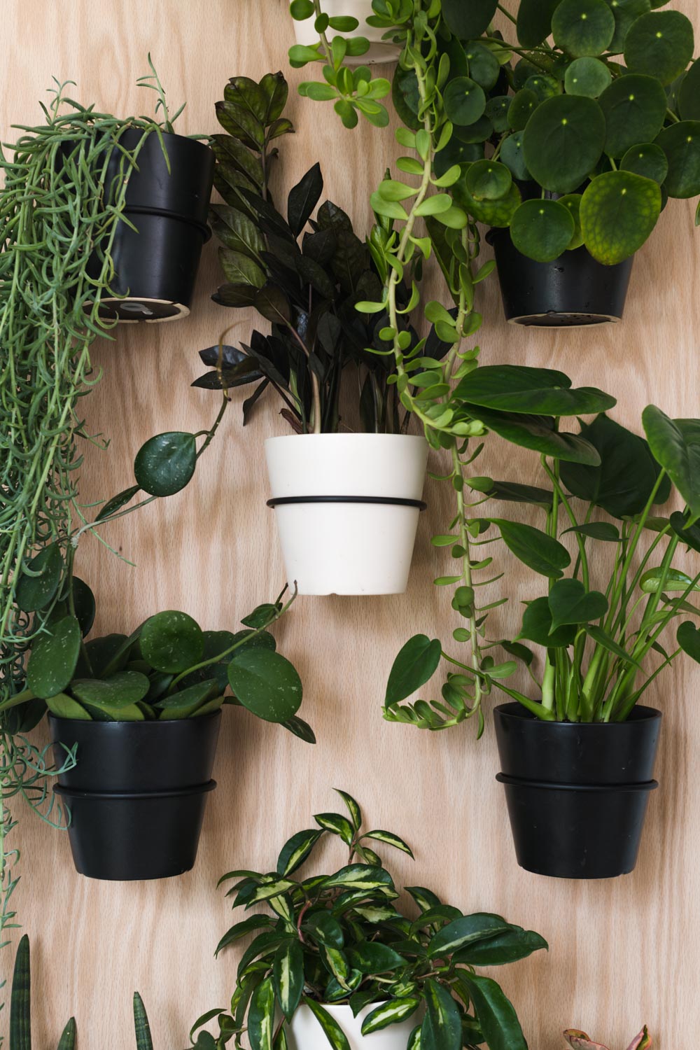
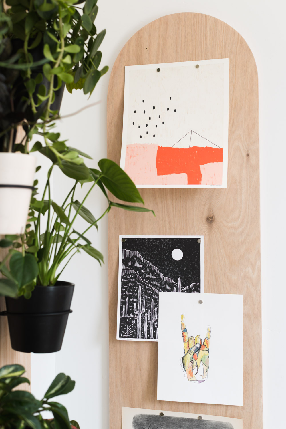
The arched magnetic wood memo board is such a perfect way to balance the design of the space and of course, bring in more plants!
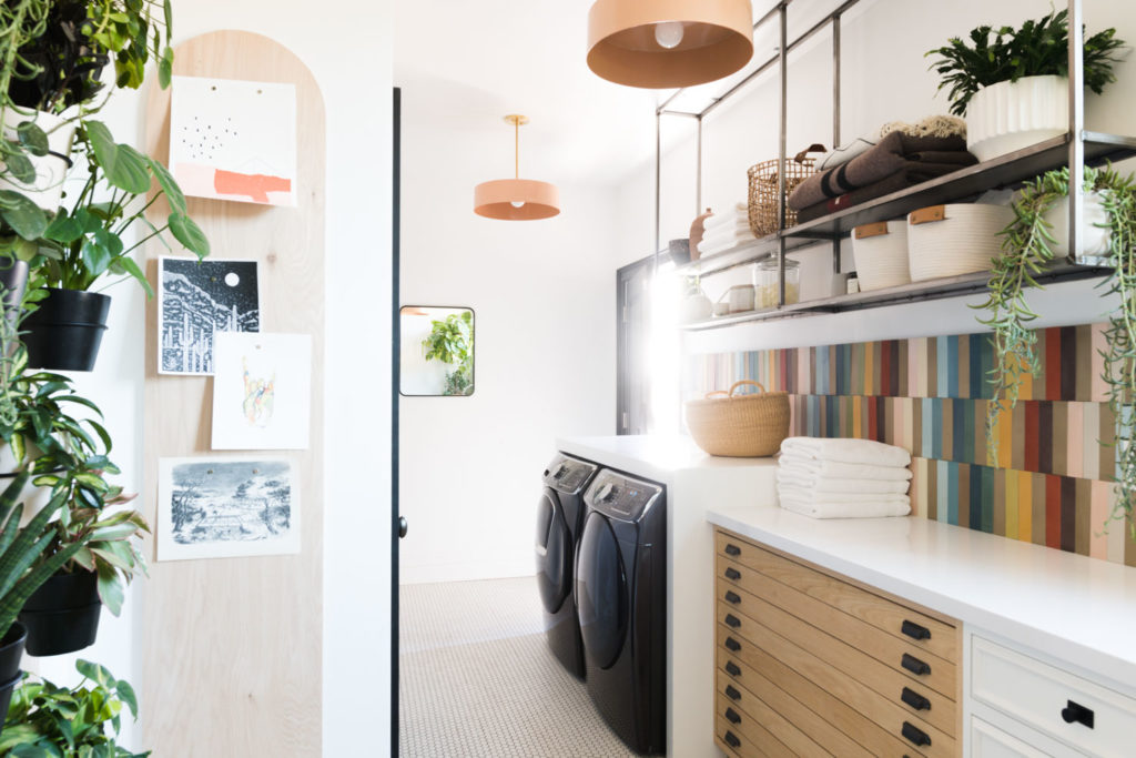
How is that for a before and after!?


Thanks for following along with our renovation friend, it means the world to us!!
If you are new to the Merc series, you can relive it from the beginning here!
The post Rainbow Tile Laundry Room Renovation Reveal appeared first on Vintage Revivals.
from Vintage Revivals https://vintagerevivals.com/rainbow-tile-laundry-room-renovation-reveal/
from
https://summerblakeley.wordpress.com/2020/04/15/rainbow-tile-laundry-room-renovation-reveal/
No comments:
Post a Comment